I finally scanned the pictures of the drawings and prints I made in Karen Carter’s class last month, so here they are – well, most of them. I’m not including the warm up exercises, as they were very similar to those we did at the previous class.
After them, we were each given an A2 (16.5″ by 23.5″) piece of paper and told to draw lines to divide it into 8 spaces of any shapes and sizes we want. Next we were given a list of attributes and told to write one at the top of each space – shape, surface pattern, viewpoint, line, graphic, detail, tone, and texture. Each student was given an object and materials and we were told we had 10 minutes (I think that is right – something like that, anyway) to draw that object using only those materials.
After each 10-minute period, we had to pass the object to the student on our right and the materials to the student on our left, so we all got to try everything (some more than once), but we each got different combinations of objects and materials. For each new combination, we had to decide on a space on the paper, and draw it with that attribute in mind. Each time, there were fewer spaces, and trying to find an appropriate one for the object and materials got more difficult.
So, here are my results from those exercises – please remember the short time allowed for each one. Also, the pictures aren’t all to the same scale.
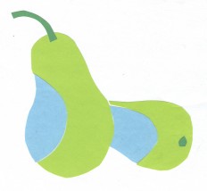
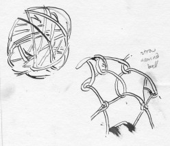
#1 was a pear, using 3 colours of paper (no choice of colours), scissors and a glue stick. “Shape” seemed the obvious category for that one, and I liked the result. #2 was a nightmare – a hollow ball made of randomly wrapped cane, and a coconut wrapped with looped straw or raffia, using a dip pen and ink. I chose “surface texture” for those.
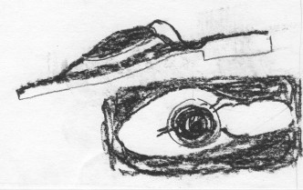
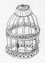
#3 was a very fancy pair of sandals (or flipflops or thongs, depending where you live) using charcoal, which I put in the “viewpoint” space. #4 was a little (about 6″ or 8″ tall) candle holder in the form of a wire and pressed metal birdcage. That seemed to lend itself to “line” better than the other remaining options. That one was really challenging to do in such a short time, and it shows.
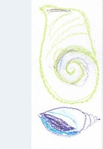
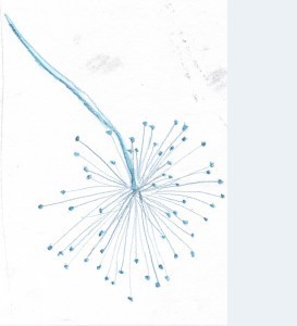
#5 was a shell using 3 colours of oil pastels (again, no choice of colours) and liquid vaseline. Hmmm … which category? I settled for “graphic” – I wasn’t sure what that was, even after Karen explained, and I wasn’t the only person confused. The shell was very nice, but I didn’t like using the oil pastels, and the liquid vaseline was horrible – it just soaked into the paper as a greasy stain and didn’t seem to intensify or blend the pastels as I think it was supposed to do. I tried drawing the shell from two different angles, but it still didn’t work. #6 was a lovely seed head. I enjoyed using the water-soluble pencil to draw it for the “detail” section. I used water and a brush on the stem and the seeds.
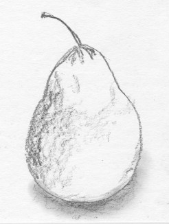
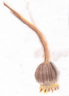
Now the only categories left were “tone” and “texture”. #7 was the pear, which had returned to me, and Karen had given us graphite pencils (like the Progresso all graphite ones, I think) for this round, so it seemed a natural for “tone”. I quite like this drawing. That just left “texture” for #8. Karen gave us some new items (I got this seed head – a poppy, I think) and 3 colours of soft pastels. I might have done a better job with it but I was tired by then and needed lunch.
In the afternoon, we tackled monoprints, which was great fun. I’ve always been fascinated by printing of any kind. However, it is now well past midnight, so I will leave posting about those (and correcting any typos in this) until the morning or, more likely, until sometime over this long holiday weekend.

