I’ve been preoccupied this summer with a sick cat. As I said in June, our 18 year old tortie Wysi ‘crashed’ due to CRF and needed a lot of care (including 2 hourly feeds for a few weeks). Just as we got her CRF stabilised, she was diagnosed as hyperthyroid. She’s been on medication for that for a month now, and she is having a lot of gut problems which may be due to that medication or may be due to her CRF. She’s had 3 stays at the vet’s on IV, from which she comes home with a pretty bandage on one leg (doesn’t she look impressed with that?), and too many other visits for me to count. I hope we’ll get her re-stabilised soon, for her sake and ours.
So, I’ve not had much craft stuff to blog about recently. I have done a little more of the Icarus, though I need to tink a couple of rows as I lost concentration while knitting at our monthly spinning evening – no pictures of that, though.
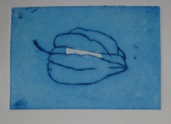
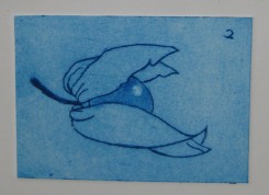
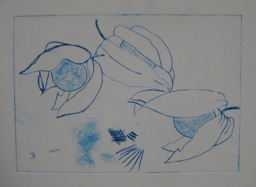
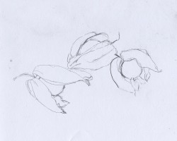
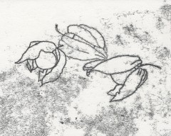
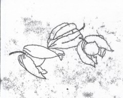
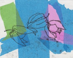
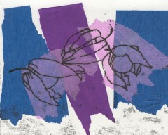
We went to a 2-day printmaking workshop with Karen Carter last month. Because we were shown how to use the etching press safely, that ‘qualified’ us to go to the monthly printmaking afternoons at the college, which we did last Saturday. The workshop covered collagraphs, drypoint ‘etching’ and linocuts. DH did some amazing drypoint prints, but I just did a lot of test prints and samples. I decided to use the same drawings I’d used for the monoprints in April so I could compare the difference in line quality more easily (and because I was too brain-dead that week to come up with new images). These are not supposed to be aesthetically interesting – just trying out techniques. I also used the backgrounds to try some different effects.
Drypoint is a technique which produces prints which look like etchings, but instead of using acid, you ‘draw’ your image onto a synthetic plate with a needle tool, or add texture with an abrasive. I started with a ‘frosted’ translucent polypropylene sheet – the kind sometimes used to make filing folders. One side is more textured than the other – the first sample is the smoother side.
Next I tried using a sheet of Rhenalon, which is smooth and transparent. I found it more difficult to use than the polypropylene, as if I used enough pressure to get a clear line the tool slipped too easily. DH preferred it, though, as he likes the clear background.
I also did some collagraph samples at the workshop, and although I didn’t have time to do any linocuts there, I did get one done at the open studio. I’ll try to get scans or photos of those soon and post them here.
I’ve been trying to get my crafting mojo back, with semi-success. I even got out the bag with my Icarus shawl – just got the bag out, haven’t re-started knitting it yet. :-(
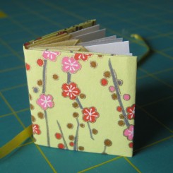
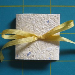
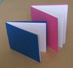
However, I did make another ‘tiny book’, this time using a Blizzard Book kit I got from Etsy. The only one the seller had available had yellow and pink cover paper – not a colour combination I like, but I wanted the instructions more than the paper. Here it is as made up from the kit, and then re-covered with ginburi momigami paper which I love (wrinkled, with silver and gold flakes):
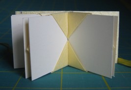
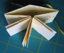
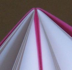
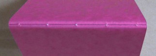
The Blizzard Book structure was devised by Hedi Kyle when she was trapped inside during a blizzard, hence the name. The spine and cover are each folded from a single piece of paper, with no glueing, and the stiffer pages just slip into the pockets in the spine, so they can be removed if wanted. The pages which came with the kit seemed a little too small to fit in the pockets securely enough, so I replaced those too. The finished book is 1.5? square, with the pages just slightly smaller. These pictures show the structure better:
Lastly, I’ve finally gave in and bought volumes 1 to 3 of Keith Smith’s bookbinding books (the ‘bibles’ of non-adhesive bindings) and his “Bookbinding for Book Artists”, so watch for future experiments posted here.
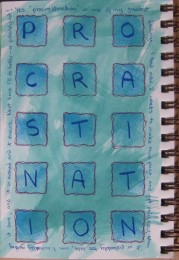
Well, the title says it all … and so does the page itself. What inspired me to choose that theme? My own procrastination, of course!
The page had been pre-painted a while ago with FW acrylic inks. I don’t have any stencils, so I cut my own square grid from an OHP sheet and used a stamp pad ‘direct to page’ over the over it. I then used a Marvy Le Plume II (brush end) to write the main word, then the fine end to write the text around the edge. The page looked too dull at that point, and the stencilled squares didn’t stand out enough, so I used a scarlet Le Plume II to do wiggly borders around the squares. OK, not brilliant, but not too bad.
Actually, I do have an excuse for my procrastination, as we’ve been dealing with a very sick kitty (CRF) for the past three weeks, so my mind hasn’t been on art or crafts, but I needed the distraction today. We still don’t know whether she is going to make it, but we are doing everything we can to help her.
What finally inspired me? My own procrastination!
The page had been pre-painted a while ago with FW acrylic inks. I don’t have any stencils, so I cut my own square grid from an OHP sheet and used a stamp pad ‘direct to page’ over the over it. I then used a Marvy Le Plume II (brush end) to write the main word, then the fine end to write the text around the edge. The page looked too dull at that point, and the stencilled squares didn’t stand out enough, so I used a scarlet Le Plume II to do wiggly borders around the squares. OK, not brilliant, but not too bad.
Actually, I do have an excuse for my procrastination, as we’ve been dealing with a very sick kitty (CRF) for the past three weeks, so my mind hasn’t been on art or crafts, but I needed the distraction today. We still don’t know whether she is going to make it, but we are doing everything we can to help her.
These two pamphlet stitch books were made from a single sheet of Gerstaecker cartridge/watercolour paper. I am considering using this paper for making journals, as it is very economic and it is supposed to cope with wet media. I made these small books so that I and a friend can test it.
The blue book is a single 4-sheet signature, with pages 6? by 5? (15.2cm by 12.5cm). The pink one is a 5-hole Japanese double pamphlet stitch binding, with two 4-sheet signatures, and the pages are 6? square (15.2cm). The card covers of both books are just slightly larger than their pages.
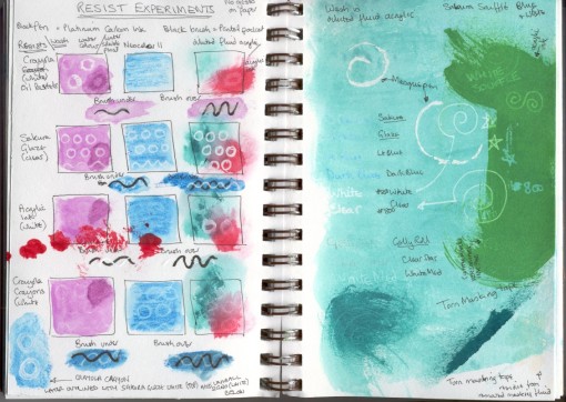
The theme for the May Challenge on The Sketchbook Challenge blog is “Can’t Resist” – using resists or journalling about something irresistible or both. First I experimented a bit with resists:
I think the labels are clear enough if you click for the larger version. The two I find most interesting are the white acrylic ink resist, which apparently only works for other acrylics, and the Crayola oil pastels. The oil pastels resisted watercolours but not the water-soluble Neocolor IIs, and they actually took the water-soluble pencils more strongly than the non-resist areas – weird!
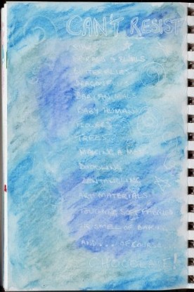 I decided to write a list of things I can’t resist – just a small selection, as there are a lot of things which I am not good at resisting. Again, click on the picture for a bigger version.
I used a white Crayola crayon (title and left column) and a clear Sakura Glaze pen (list and right) for my resists, and Neocolor II for the colours. The Crayola didn’t work as well as I’d hoped, though it is more visible in real life, so I tried outlining the title using a white Uniball Signo pen and that helped.
[All pictures in this post can be clicked to show a double size image, so you can see the monoprint line quality better.]
Monoprints are a type of print in which you usually only create a few copies (sometimes only one), and they are all different. The method we used is known as direct trace drawing, and is supposed to have been invented by Paul Gauguin. First, create an original drawing, and tape it to the back of a sheet of printing paper. Here is my drawing – yes, physalis fruits again!
Next, ink a perspex sheet with water-based inks which are waterproof when dry, which makes it possible to do more work on the print later if wanted. [It is possible to use oil-based printing inks too, or watercolours, gouache or other mediums.] Lay the printing paper gently over the sheet with the original drawing on top. Trace over the original drawing using a pencil, pen or other instrument.
The printing paper will pick up ink along the drawn lines, but in a soft, smudgy way. Anywhere you touch the paper will also produce a smudge, so you need to avoid touching the paper as much as possible, but you can also create shading with deliberate touching.
Judging the correct amount of ink to use on the sheet requires experience (and trial and error), but you can re-roll the sheet without adding more, so each successive print will have less ink. You can also remove excess ink before trying again by laying absorbent paper like newsprint over the sheet and smoothing gently. The print on the left above was done first, then the one on the right was done without adding fresh ink, just re-rolling.
You don’t have to print onto plain paper. We collaged tissue paper onto the printing paper before making some of the prints. You can also do further work on the image after printing, but we didn’t have time to do that at the class. There also wasn’t time for me to experiment with deliberate pressure to produce shaded areas.
We have signed up for a printmaking class with Karen Carter (the tutor for this class) at the same venue in August, and I am greatly looking forward to it. I am hoping to experiment with more monoprinting at home before then, and perhaps try some collagraphs too.
I finally scanned the pictures of the drawings and prints I made in Karen Carter’s class last month, so here they are – well, most of them. I’m not including the warm up exercises, as they were very similar to those we did at the previous class.
After them, we were each given an A2 (16.5″ by 23.5″) piece of paper and told to draw lines to divide it into 8 spaces of any shapes and sizes we want. Next we were given a list of attributes and told to write one at the top of each space – shape, surface pattern, viewpoint, line, graphic, detail, tone, and texture. Each student was given an object and materials and we were told we had 10 minutes (I think that is right – something like that, anyway) to draw that object using only those materials.
After each 10-minute period, we had to pass the object to the student on our right and the materials to the student on our left, so we all got to try everything (some more than once), but we each got different combinations of objects and materials. For each new combination, we had to decide on a space on the paper, and draw it with that attribute in mind. Each time, there were fewer spaces, and trying to find an appropriate one for the object and materials got more difficult.
So, here are my results from those exercises – please remember the short time allowed for each one. Also, the pictures aren’t all to the same scale.
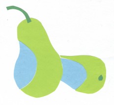
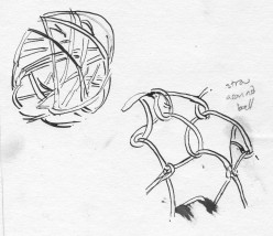
#1 was a pear, using 3 colours of paper (no choice of colours), scissors and a glue stick. “Shape” seemed the obvious category for that one, and I liked the result. #2 was a nightmare – a hollow ball made of randomly wrapped cane, and a coconut wrapped with looped straw or raffia, using a dip pen and ink. I chose “surface texture” for those.
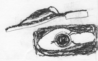
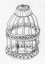
#3 was a very fancy pair of sandals (or flipflops or thongs, depending where you live) using charcoal, which I put in the “viewpoint” space. #4 was a little (about 6″ or 8″ tall) candle holder in the form of a wire and pressed metal birdcage. That seemed to lend itself to “line” better than the other remaining options. That one was really challenging to do in such a short time, and it shows.
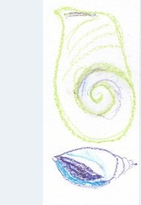
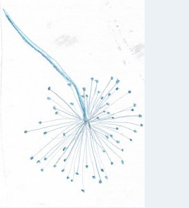
#5 was a shell using 3 colours of oil pastels (again, no choice of colours) and liquid vaseline. Hmmm … which category? I settled for “graphic” – I wasn’t sure what that was, even after Karen explained, and I wasn’t the only person confused. The shell was very nice, but I didn’t like using the oil pastels, and the liquid vaseline was horrible – it just soaked into the paper as a greasy stain and didn’t seem to intensify or blend the pastels as I think it was supposed to do. I tried drawing the shell from two different angles, but it still didn’t work. #6 was a lovely seed head. I enjoyed using the water-soluble pencil to draw it for the “detail” section. I used water and a brush on the stem and the seeds.
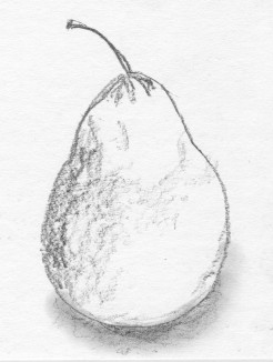
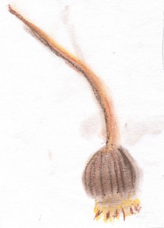
Now the only categories left were “tone” and “texture”. #7 was the pear, which had returned to me, and Karen had given us graphite pencils (like the Progresso all graphite ones, I think) for this round, so it seemed a natural for “tone”. I quite like this drawing. That just left “texture” for #8. Karen gave us some new items (I got this seed head – a poppy, I think) and 3 colours of soft pastels. I might have done a better job with it but I was tired by then and needed lunch.
In the afternoon, we tackled monoprints, which was great fun. I’ve always been fascinated by printing of any kind. However, it is now well past midnight, so I will leave posting about those (and correcting any typos in this) until the morning or, more likely, until sometime over this long holiday weekend.
A friend sent me a link to a short silent film of Estonian knitters in 1937. Like the Shetland knitters, they knitted shawls fine enough to pass through a wedding ring as well as other items. You can see the traditional Estonian nupps in the finished shawl. I included them when I knitted an Estonian lace scarf in 2004, and they are very fiddly.
It looks to me as though they were being given yarn to use and then paid for the finished goods when they took them back to the supplier. That was the way commercial knitting and weaving was usually organised in the UK back in the days before they became factory-based processes, but it is rare now.
Same old, same old – I will get those drawings and prints scanned soon!
Meanwhile … I told you about the Green Isle Crafts blog in my last post. Well, Tee is having another giveaway, this time a ‘scholarship’ to enable a student to take her latest online class for free. She shows how to use readily available materials to make rustic journals like these:
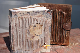
For more details, a teaser video and your chance to enter, click here.
I still haven’t scanned my drawings and prints from the second workshop – sorry! I’ll try to get around to it very soon. Meanwhile, I want to tell my readers (if I have any) about a blog and a giveaway. Green Isle Crafts is one of my regular blog-visiting stops. Tee posts tips, journal prompts (well, art prompts, really, not just for journalling), videos and step-by-step descriptions of how she made each featured page. Today I had two “oh, of course!” moments while watching the video – when she made a very simple torn paper stencil which gave a very informal effect, and when she used a piece of ‘retired’ bubble mailer for bubble wrap printing, which looks a lot easier than dealing with loose floppy pieces of bubble wrap.
I mentioned a book giveaway in the post title. Tee is giving a copy of “Surface Treatment Workshop: Explore 45 Mixed-Media Techniques” by McElroy and Duran-Wilson. I’ve been browsing the Look Inside on Amazon, and it seems very interesting. All you need to do to enter is comment on this blog post. That’s well worth the effort for a chance to win, and I hope that after checking out Tee’s blog, you’ll become a regular reader like me.

