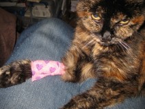
I’ve been preoccupied this summer with a sick cat. As I said in June, our 18 year old tortie Wysi ‘crashed’ due to CRF and needed a lot of care (including 2 hourly feeds for a few weeks). Just as we got her CRF stabilised, she was diagnosed as hyperthyroid. She’s been on medication for that for a month now, and she is having a lot of gut problems which may be due to that medication or may be due to her CRF. She’s had 3 stays at the vet’s on IV, from which she comes home with a pretty bandage on one leg (doesn’t she look impressed with that?), and too many other visits for me to count. I hope we’ll get her re-stabilised soon, for her sake and ours.
So, I’ve not had much craft stuff to blog about recently. I have done a little more of the Icarus, though I need to tink a couple of rows as I lost concentration while knitting at our monthly spinning evening – no pictures of that, though.
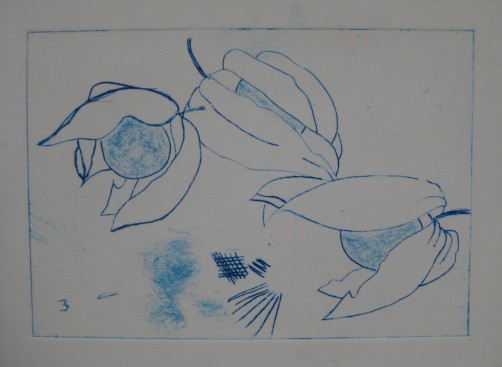
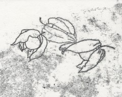
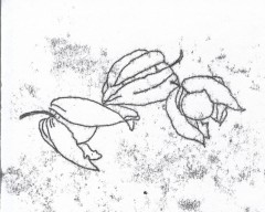
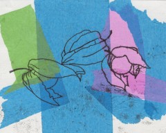
We went to a 2-day printmaking workshop with Karen Carter last month. Because we were shown how to use the etching press safely, that ‘qualified’ us to go to the monthly printmaking afternoons at the college, which we did last Saturday. The workshop covered collagraphs, drypoint ‘etching’ and linocuts. DH did some amazing drypoint prints, but I just did a lot of test prints and samples. I decided to use the same drawings I’d used for the monoprints in April so I could compare the difference in line quality more easily (and because I was too brain-dead that week to come up with new images). These are not supposed to be aesthetically interesting – just trying out techniques. I also used the backgrounds to try some different effects.
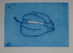
Drypoint is a technique which produces prints which look like etchings, but instead of using acid, you ‘draw’ your image onto a synthetic plate with a needle tool, or add texture with an abrasive. I started with a ‘frosted’ translucent polypropylene sheet – the kind sometimes used to make filing folders. One side is more textured than the other – the first sample is the smoother side.
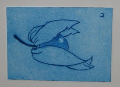
Next I tried using a sheet of Rhenalon, which is smooth and transparent. I found it more difficult to use than the polypropylene, as if I used enough pressure to get a clear line the tool slipped too easily. DH preferred it, though, as he likes the clear background.
I also did some collagraph samples at the workshop, and although I didn’t have time to do any linocuts there, I did get one done at the open studio. I’ll try to get scans or photos of those soon and post them here.
[All pictures in this post can be clicked to show a double size image, so you can see the monoprint line quality better.]
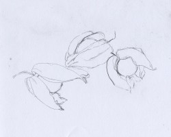
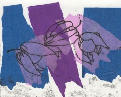
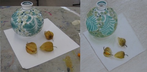
Monoprints are a type of print in which you usually only create a few copies (sometimes only one), and they are all different. The method we used is known as direct trace drawing, and is supposed to have been invented by Paul Gauguin. First, create an original drawing, and tape it to the back of a sheet of printing paper. Here is my drawing – yes, physalis fruits again!
Next, ink a perspex sheet with water-based inks which are waterproof when dry, which makes it possible to do more work on the print later if wanted. [It is possible to use oil-based printing inks too, or watercolours, gouache or other mediums.] Lay the printing paper gently over the sheet with the original drawing on top. Trace over the original drawing using a pencil, pen or other instrument.
The printing paper will pick up ink along the drawn lines, but in a soft, smudgy way. Anywhere you touch the paper will also produce a smudge, so you need to avoid touching the paper as much as possible, but you can also create shading with deliberate touching.
Judging the correct amount of ink to use on the sheet requires experience (and trial and error), but you can re-roll the sheet without adding more, so each successive print will have less ink. You can also remove excess ink before trying again by laying absorbent paper like newsprint over the sheet and smoothing gently. The print on the left above was done first, then the one on the right was done without adding fresh ink, just re-rolling.
You don’t have to print onto plain paper. We collaged tissue paper onto the printing paper before making some of the prints. You can also do further work on the image after printing, but we didn’t have time to do that at the class. There also wasn’t time for me to experiment with deliberate pressure to produce shaded areas.
We have signed up for a printmaking class with Karen Carter (the tutor for this class) at the same venue in August, and I am greatly looking forward to it. I am hoping to experiment with more monoprinting at home before then, and perhaps try some collagraphs too.
I finally scanned the pictures of the drawings and prints I made in Karen Carter’s class last month, so here they are – well, most of them. I’m not including the warm up exercises, as they were very similar to those we did at the previous class.
After them, we were each given an A2 (16.5″ by 23.5″) piece of paper and told to draw lines to divide it into 8 spaces of any shapes and sizes we want. Next we were given a list of attributes and told to write one at the top of each space – shape, surface pattern, viewpoint, line, graphic, detail, tone, and texture. Each student was given an object and materials and we were told we had 10 minutes (I think that is right – something like that, anyway) to draw that object using only those materials.
After each 10-minute period, we had to pass the object to the student on our right and the materials to the student on our left, so we all got to try everything (some more than once), but we each got different combinations of objects and materials. For each new combination, we had to decide on a space on the paper, and draw it with that attribute in mind. Each time, there were fewer spaces, and trying to find an appropriate one for the object and materials got more difficult.
So, here are my results from those exercises – please remember the short time allowed for each one. Also, the pictures aren’t all to the same scale.
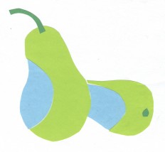
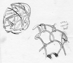
#1 was a pear, using 3 colours of paper (no choice of colours), scissors and a glue stick. “Shape” seemed the obvious category for that one, and I liked the result. #2 was a nightmare – a hollow ball made of randomly wrapped cane, and a coconut wrapped with looped straw or raffia, using a dip pen and ink. I chose “surface texture” for those.
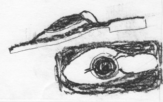
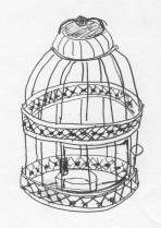
#3 was a very fancy pair of sandals (or flipflops or thongs, depending where you live) using charcoal, which I put in the “viewpoint” space. #4 was a little (about 6″ or 8″ tall) candle holder in the form of a wire and pressed metal birdcage. That seemed to lend itself to “line” better than the other remaining options. That one was really challenging to do in such a short time, and it shows.
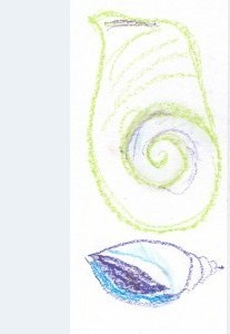
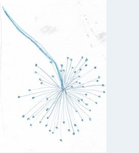
#5 was a shell using 3 colours of oil pastels (again, no choice of colours) and liquid vaseline. Hmmm … which category? I settled for “graphic” – I wasn’t sure what that was, even after Karen explained, and I wasn’t the only person confused. The shell was very nice, but I didn’t like using the oil pastels, and the liquid vaseline was horrible – it just soaked into the paper as a greasy stain and didn’t seem to intensify or blend the pastels as I think it was supposed to do. I tried drawing the shell from two different angles, but it still didn’t work. #6 was a lovely seed head. I enjoyed using the water-soluble pencil to draw it for the “detail” section. I used water and a brush on the stem and the seeds.
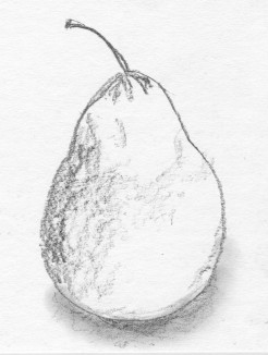
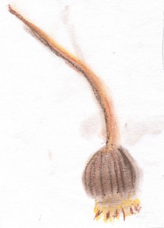
Now the only categories left were “tone” and “texture”. #7 was the pear, which had returned to me, and Karen had given us graphite pencils (like the Progresso all graphite ones, I think) for this round, so it seemed a natural for “tone”. I quite like this drawing. That just left “texture” for #8. Karen gave us some new items (I got this seed head – a poppy, I think) and 3 colours of soft pastels. I might have done a better job with it but I was tired by then and needed lunch.
In the afternoon, we tackled monoprints, which was great fun. I’ve always been fascinated by printing of any kind. However, it is now well past midnight, so I will leave posting about those (and correcting any typos in this) until the morning or, more likely, until sometime over this long holiday weekend.
I’m sorry I’m still being bad about posting regularly. Life has continued to be difficult, but I won’t go on about that. We did get to the drawing classes referred to in my last post, though, and we’ve booked for a printmaking class with the second tutor in August.
The March class was Creative Drawing, with Lyn Ebbett. The description said “for those who think they can’t draw or want to develop their drawing skills” – I’m in the first category, and DH is in the second. As expected, I was well outside my comfort zone, but that’s why I went to the class.
We started with warm-up exercises. Lyn had brought a variety of props for us, but she started by giving us each a small object to draw. Mine was a metal button with a complex embossed design, and my drawing was awful, so I’m not posting a picture of that.
Next, she gave us each a physalis fruit like these:
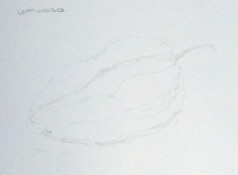
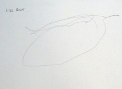
We had to draw our physalis with our non-dominant hands (sorry this one is so faint), with a continuous line (that is, not lifting our pencils off the paper, with our eyes shut (really!!!) and using only straight lines. It was a timed exercise, with only 5 minutes (I think) for each drawing. Click on the following images for bigger versions, as usual:
The next exercise was to tape a marker pen to a 3ft bamboo garden cane, put the drawing paper on the floor, and (standing up) draw the same physalis again. This is my first, and favourite, attempt:
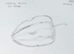
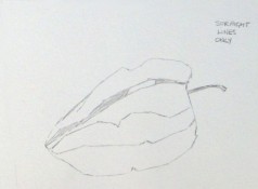
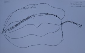
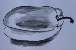
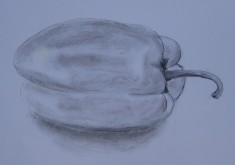
After that, we got to choose our own subject from what she had brought. For some unfathomable reason, I chose a yellow pepper. First we had to draw it with a brush and Indian ink, and then with charcoal. My charcoal one was much better, as you can see:
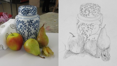
The final exercise was a still life group. We were able to choose from all the objects Lyn had brought, but some of my favourites had already been taken by the time I got to the table. The photo was taken from a slightly different angle to the view from where I was sitting. Lyn suggested I add the cloth at the left after I’d already started drawing the rest, but I ran out of time … and anyway, I think it was technically beyond me to make it look like a folded cloth. I didn’t finish the pattern on the jar either.
Now, for a treat, here is DH’s final drawing. He chose to use soft pastels instead of pencil. Again, the photo is from a slightly different angle:
So, those were the results of 6 hours or so of hard work and fun. I haven’t scanned the drawings from April’s class, so I’ll post those soon.
